First of all, MERRY CHRISTMAS AND HAPPY HOLIDAYS!! Now, onto my favorite covers of 2012:
Books I read and have a cover that matches the story:
Why is it a favorite? The cover definitely conveys the impotent tone of the book and of there is one thing I love, it would be a cover that matches the story. My only complaint is Out of Reach takes place in the SUMMER. In a BEACH. And the girl is wearing a leather jacket, scarf and beanie...
Why is it a favorite? I love the certain cartoon-ish look that this cover has. I have not seen how it looks in person so I'm not sure if the cartoon-ish feel is present in the hardcover so hopefully it is. I also LOVE London in the background.The cute: (I didn't read this book)
The beautiful art: (I didn't read any of these books)
Why is it a favorite? I saw this for the first time when Lena @Addicted 2 Novels reviewed it. Do I honestly have to say why I love it? Just look at it. Also, check out the cover story of the book.
Why is it a favorite? Both of editions of the cover are just wonderful. The art, the colors, JUST EVERYTHING.
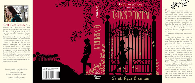
Why is it a favorite? Can I you tell I like these type of covers? Because I do!!
Why is it a favorite? This is one of the most unique covers ever and it stands out which is exactly what Harlequin Teen was aiming for, I'm sure. And don't think it's a plain white cover because it's not, the texture is really nice. It's also fitting with the title. Speechless, empty cover, makes sense, right?
Why is it a favorite? Unbreak myy heaaaaart, say you loooove meee agaaaaaaaaaaaaain. Undoooo this hurt that you causeed-- ok I'm done. But I have to sing this song every time I see this cover/title. Melissa Walker has a weekly feature called Cover Stories and surprisingly, it's about the making and story behind covers. So check out THIS post to see the many facelifts Unbreak My Heart went through. Anyways, when I was at the Laini Taylor author signing, my eyes were drawn to this cover allll the way across the room where it was on display, It is just soooooo damn cute. So I loved it when I first saw it but it really has that certain PICK ME UP quality, I believe. (or the girl in me says so.)
These covers are awesome, no?I hope everyone is having a lovely holiday or if you don't celebrate, a lovely day. I'm on may to see Las Vegas!! Here I come, Céline Dion!!!!


No comments:
Post a Comment